


반응형
JSX는 backgroundColor와 같이 카멜 표기법으로 작성해야한다.
expo init react-native-style
./src/App.js 생성
인라인 스타일링
컴포넌트에 직접 스타일을 입력하는 방식
객체 형태로 전달
import React from 'react';
import { View, Text } from 'react-native';
const App = () => {
return (
<View
style={{
flex: 1,
backgroundColor: '#fff',
alignItems: 'center',
justifyContent: 'center',
}}
>
<Text
style={{
padding: 10,
fontSize: 26,
fontWeight: '600',
color: 'black',
}}
>
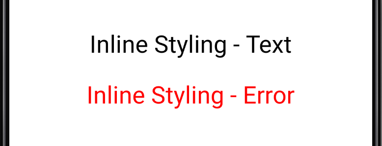
Inline Styling - Text
</Text>
<Text
style ={{
padding: 10,
fontSize: 26,
fontWeight: '400',
color: 'red',
}}
>
Inline Styling - Error
</Text>
</View>
);
};
export default App;
명확하게 어떤 스타일인지 보이지만,
비슷한 역할을 하는 컴포넌트에 동일한 코드가 반복되고,
어떤 이유로 해당 스타일이 적용되었는지 가늠하기 힘듬
클래스 스타일링
컴포넌트의 태그에 직접 입력 X
스타일 시트에 정의된 스타일을 사용
import React from 'react';
import { StyleSheet, View, Text } from 'react-native';

const App = () => {
    return (
        <View style = {styles.container}>
            <Text style = {styles.text}> Text </Text>
            <Text style = {styles.error}> Error </Text>
        </View>
    );
};


const styles = StyleSheet.create({
    container: {
        flex: 1,
        backgroundColor: '#fff',
        alignItems: 'center',
        justifyContent: 'center',
    },
=> padding, fontsize, fontweight, color를 지정한 이유를 보여줌
(예를 들어 색을 바꿀 때 text객체의 color만 바꾸어주면 되어 편함)
    text: {
        padding: 10,
        fontSize: 26,
        fontweight: '600',
        color: 'black',
    },
=> padding, fontsize, fontweight, color를 지정한 이유를 보여줌
    error: {
        padding: 10,
        fontSize: 26,
        fontWeight: '400',
        color: 'red',
    },

});


export default App;
여러개 스타일 적용
위의 text와 error는 중복된 스타일이 많음.
두 스타일 모두 Text 컴포넌트에 적용되는 스타일임
배열을 이용하여 여러 개의 스타일 적용
mport React from 'react';
import { StyleSheet, View, Text } from 'react-native';

const App = () => {
    return (
        <View style = {styles.container}>
            <Text style = {styles.text}> Text </Text>
            => 뒤에 오는 스타일이 앞에 있는 스타일을 덮음
            <Text style = {[styles.text,styles.error]}> Error </Text>
        </View>
    );
};


const styles = StyleSheet.create({
    container: {
        flex: 1,
        backgroundColor: '#fff',
        alignItems: 'center',
        justifyContent: 'center',
    },

    text: {
        padding: 10,
        fontSize: 26,
        fontweight: '600',
        color: 'black',
    },

    error: {
        fontWeight: '400',
        color: 'red',
    },

});


export default App;
상황에 따라 인라인, 클래스 스타일 방식 혼용
import React from 'react';
import { StyleSheet, View, Text } from 'react-native';

const App = () => {
    return (
        <View style = {styles.container}>
            <Text style = {[styles.tex, { color: 'green'}]}> Text </Text> <= 배열사용, 혼용
            <Text style = {[styles.text,styles.error]}> Error </Text>
        </View>
    );
};


const styles = StyleSheet.create({
    container: {
        flex: 1,
        backgroundColor: '#fff',
        alignItems: 'center',
        justifyContent: 'center',
    },

    text: {
        padding: 10,
        fontSize: 26,
        fontWeight: '600',
        color: 'black',
    },

    error: {
        fontWeight: '400',
        color: 'red',
    },

});


export default App;

외부 스타일 사용
만든 스타일을 다양한 곳에서 사용가능
외부 파일에 스타일을 정의하고 여러개의 파일에서 스타일을 공통으로 사용
./src/styles.js 생성
import {StyleSheet} from 'react-native';

export const viewStyles = StyleSheet.create({
    container: {
        flex: 1,
        backgroundColor: '#fff',
        alignItems: 'center',
        justifyContent: 'center',
    },
});

export const textStyles = StyleSheet.create({
    text: {
        padding: 10,
        fontSize: 26,
        fontWeight: '600',
        color: 'black',
    },

    error: {
        fontWeight: '400',
        color: 'red',
    },
});
//App.js


import React from 'react';
import { View, Text } from 'react-native';
import { viewStyles, textStyles } from './styles'; => ./styles에서 viewStyles, textStyles 가져옴


const App = () => {
    return (
        <View style = {viewStyles.container}>
            <Text style = {[textStyles.text, { color: 'green'}]}> Text </Text>
            <Text style = {[textStyles.text,textStyles.error]}> Error </Text>
        </View>
    );
};


export default App;
728x90
반응형
'공부 > 리액트 네이티브' 카테고리의 다른 글
| 스타일 속성 (0) | 2021.05.09 |
|---|---|
| 리액트 네이티브 - 이벤트 (0) | 2021.05.06 |
| 리액트 네이티브 - props (0) | 2021.05.06 |
| 리액트 네이티브 - props (0) | 2021.05.06 |
| 리액트 네이티브 - button 컴포넌트 (0) | 2021.05.06 |

아상관없어