


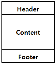
반응형
flex
import React from 'react';
import { StyleSheet, View, Text } from 'react-native';

export const Header = () => {
    return (
        <View style = {[styles.container, styles.header]}>
            <Text style={styles.text}>Header</Text>
        </View>
    );
};

export const Contents = () => {
    return (
        <View style={[styles.container, styles.contents]}>
            <Text style={styles.text}>Contents</Text>
        </View>
    );
};

export const Footer = () => {
    return (
        <View style ={[styles.container, styles.footer]}>
            <Text style={styles.text}>Footer</Text>
        </View>
    );
};


const styles = StyleSheet.create({
    container: {
        width: '100%',
        alignItems: 'center',
        justifyContent: 'center',
        height: 80,
    }, => contents와 text의 height는 80으로 고정

    header: {
        backgroundColor: '#f1c40f',
        height: 640,
    }, => header의 height는 640
    contents: {
        backgroundColor: '#3498db',
    },
    text: {
        fontSize: 26,
    },
});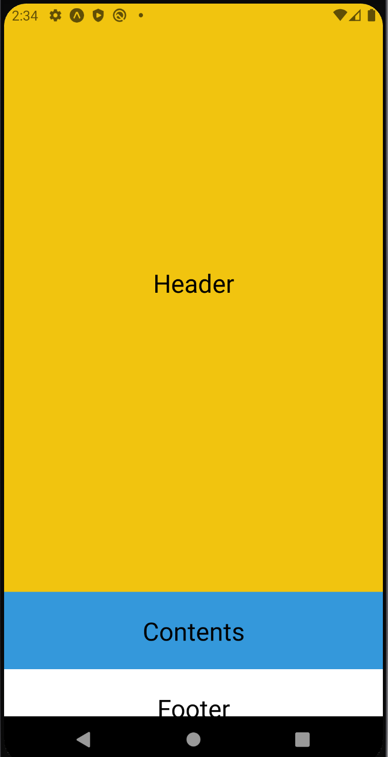
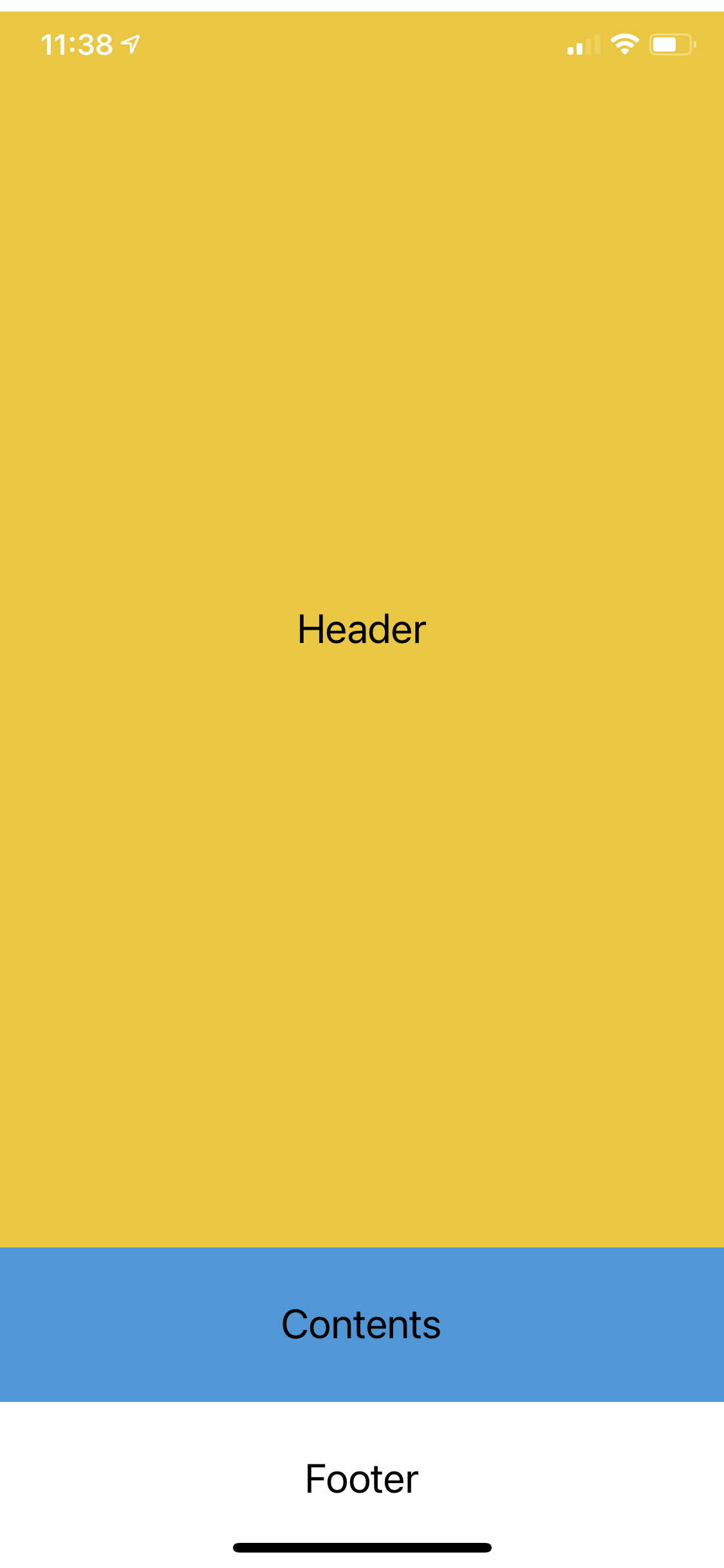
=> 아이폰 11에서는 잘리지 않고 다 보이지만 에뮬레이터에선 잘려보인다.
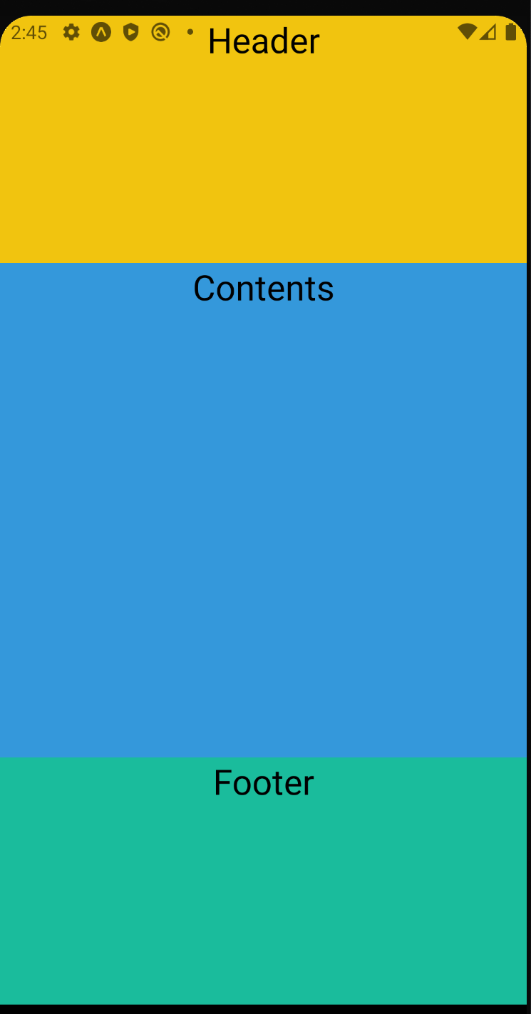
flex를 이용하면 width, height와 달리 비율로 크기가 결정된다.
-flex의 값이 0일때는 설정된 width와 heigth값에 따라 크기가 결정
-양수일 경우 felx값에 비례하여 크기가 조정
ex)
(위의 코드에서 footer를 추가하는 것을 깜빡하였다.)
import React from 'react';
import { StyleSheet, View, Text } from 'react-native';

export const Header = () => {
    return (
        <View style = {[styles.container, styles.header]}>
            <Text style={styles.text}>Header</Text>
        </View>
    );
};

export const Contents = () => {
    return (
        <View style={[styles.container, styles.contents]}>
            <Text style={styles.text}>Contents</Text>
        </View>
    );
};

export const Footer = () => {
    return (
        <View style ={[styles.container, styles.footer]}>
            <Text style={styles.text}>Footer</Text>
        </View>
    );
};

const styles = StyleSheet.create({
    container: {
        width: '100%',
        alignItems: 'center',
        justifyContent: 'center',
        height: 80,
    },

    header: {
        flex: 1,
        backgroundColor: '#f1c40f',
        height: 640,
    },
    contents: {
        flex: 2,
        backgroundColor: '#3498db',
    },
    => 추가
    footer: {
        flex: 1,
        backgroundColor: '#1abc9c',
    },

    text: {
        flex: 3,
        fontSize: 26,
    },
});
1:2:1 비율로 나누어 채워지게 된다.
정렬
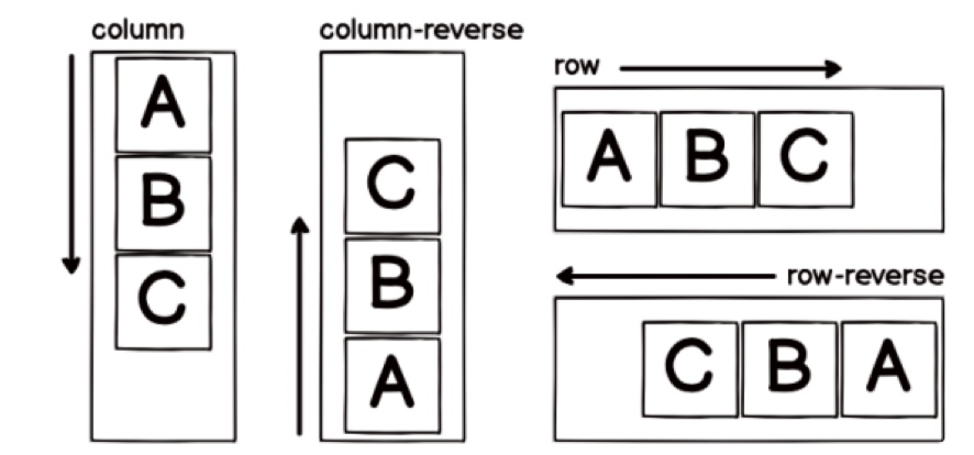
컴포넌트가 쌓이는 방향
- flexDirection사용
- justiftContent
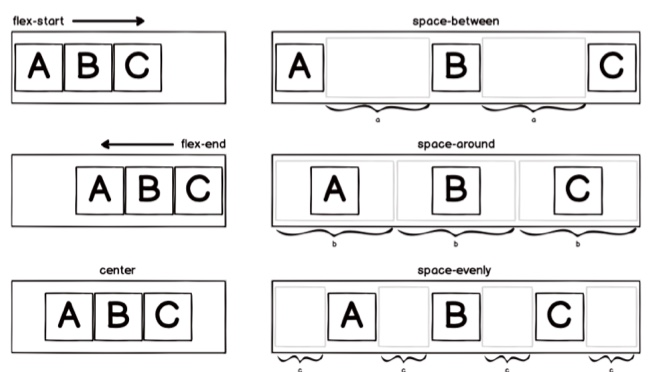
flex-start : 시작점에서부터 정렬 (기본값)
flex-end : 끝에서부터 정렬
center : 중앙 정렬
space-between : 컴포넌트 사이의 공간을 동일하게 만들어서 정렬
space-around : 컴포넌트 각가의 주변 공간을 동일하게 만들어서 정렬
space-evenly : 컴포넌트 사이와 양 끝에 동일한 공간을 만들어서 정렬
- alignItems
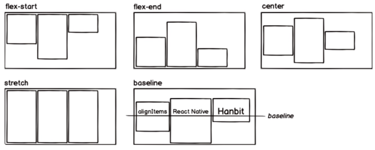
flex-start : 시작점에서부터 정렬 (기본값)
flex-end : 끝에서부터 정렬
center : 중앙정렬
strecth : alignItems의 방향으로 컴포넌트 확장
baseline : 컴포넌트 내부의 텍스트 베이스라인을 기준으로 정렬
728x90
반응형
'공부 > 리액트 네이티브' 카테고리의 다른 글
| 스타일링 (0) | 2021.05.08 |
|---|---|
| 리액트 네이티브 - 이벤트 (0) | 2021.05.06 |
| 리액트 네이티브 - props (0) | 2021.05.06 |
| 리액트 네이티브 - props (0) | 2021.05.06 |
| 리액트 네이티브 - button 컴포넌트 (0) | 2021.05.06 |

아상관없어